In this tutorial you will learn more HTML and look at CSS transformations and animations. This will allow you to write a simple HTML site that you can then view in a web browser of your choice
About this Tutorial
Objectives
Delegates will learn to develop applications using HTML5/CSS3 and JS. After completing this course, delegates will be able to:
- Use Visual Studio 2012 effectively
- Create commercial HTML5 Web Applications
- Develop Websites that may use web sockets, animations and geolocation
Audience
This course has been designed primarily for programmers new to the .Net development platform. Delegates experience solely in Windows application development or earlier versions of HTML/CSS and JavaScript will also find the content beneficial.
Prerequisites
No previous experience in web programming is required. But any experience you do have in programming will help. Also no experience in browser IDE’s is required. But again any experience you do have with programming development environments will be a valuable.
Experience using a contemporary OO language such as C++ or C# would be useful but is not required.
Download Solutions

Quick Access
Overview
Estimated Time – 1 Hour
Not what you are looking? Try the next tutorial – Graphics with Canvas
- Overview of Transitions
- CSS3 allows you to define transitions for property changes
- E.g. when a user hovers over an element…
- …increase the width over a period of 3 seconds
- To define a transition
- Set the transition property
- Specify the property to vary, and the time span
- Example (e.g. in IE10)
- See Transitions/SimpleTransition.html
- View code file.
#myPanel {

 width: 200px;

 transition: width 3s;

}

#myPanel:hover {

 width: 300px;

}
- CSS3 allows you to define transitions for property changes
- Overview of transformations
- CSS3 supports 2D transforms (and 3D – see later)
- Enables elements rendered by CSS to be transformed in 2D space
transform: transformation-functions;
- Applies a series of transformation functions to an element
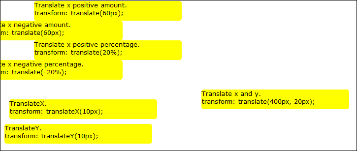
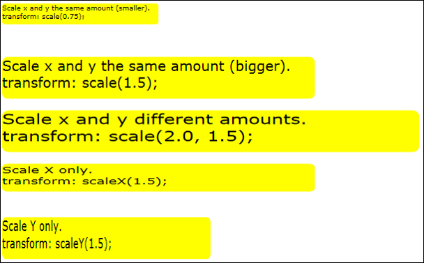
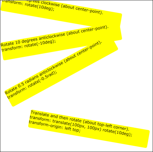
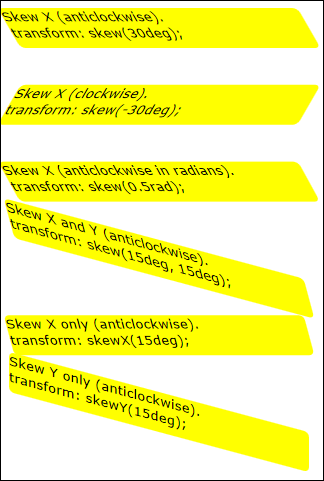
- E.g. matrix, translate, scale, rotate, skew
transform-origin: horiz-pos vert-pos;
- Establishes origin of transformation (default is center of element)
- horiz-pos can be a length, percentage, or left / center / right
- vert-pos can be a length, percentage, or top / center / bottom
- Enables elements rendered by CSS to be transformed in 2D space
- Most browsers use vendor prefixes
for these properties, for example:
-ms-transform:   translate(5px);

-webkit-transform: translate(5px);

-moz-transform:  translate(5px);

-o-transform:   translate(5px);
- CSS3 supports 2D transforms (and 3D – see later)
- Overview of Keyframe Animations
Lab 1: Transitions
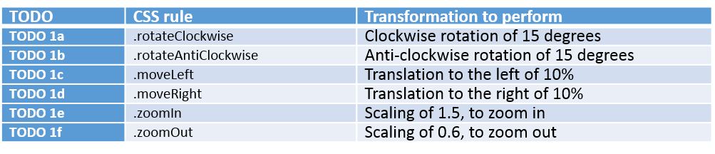
Lab 2: Transformations
Lab 3: Keyframe animations
Well done. You have completed the tutorial in the HTML5/CSS3/JS course. The next tutorial is
8. Graphics with Canvas
Copyright © 2016 TalkIT®
If you would like to see more content like this in the future, please fill-in our quick survey.