Website Design
This blog is about designing websites that look good & work. A big topic! This follows on from our from our June 2014 newsletter, How to Build Enterprise Websites.
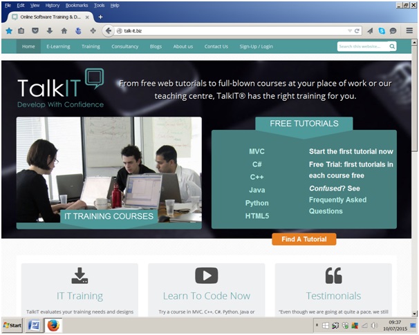
 It also draws from our background creating the TalkIT website. From the start we wanted to provide an excellent user experience. This means a site that is attractive, simple and easy to use. Messages are concise. Layout is standardised. Distractions are minimised.
As usual, I would really like to hear what you think. Please add your comments at the bottom of the blog.
5 Important Rules in Good Website Design
To guide the design processes take a look at some contemporary web design principles. These draw from the rich field of Human Computer Interface (HCI). There is a lot of good stuff on the web about this. I particularly like the articles in www.useit.com. Here is my summary of the principles.
Forgiveness
I really like this one. It allows visitors to explore without committing. They can cancel or back out of any process they have initiated. For example, visitors can look at the topics in the C# course before purchasing it.
Progressive Disclosure
Visitors are told just what they need to know at any stage. But if they want to know more they can easily find it out. For example, the FAQs page was getting very long as questions & answers were added. Now it shows only the questions. There is less to read. But visitors can click a question to reveal its answer.
Make it Easy
Visitors do not want to learn yet another system. In essence they are saying “Don’t make me think too much.” Visitors will not have to work to engage with the site itself.
Familiarity
Visitors want to become familiar with a process they use often. They want to know where they are in the process. Standardising the look of pages and page elements helps this. For example, the online tutorials have a standard look that includes labs, downloads and videos. When visitors buy a tutorial they know what they are getting.
Visitor Experience
Most visitors have many years experience of using the internet. They bring expectations based on this experience, to every new site they visit. A good design takes advantage of these facts. For example, you can launch online tutorials directly from the Home page. We assumed that most visitors will know about e-learning and are ready to start.
Don’t Make Me Think! A Common Sense Approach to Web Usability Paperback
by Steve Krug (Author)
Photos www.freedigitalphotos.net/
Thanks to Wikipedia
David Ringsell MCPD 2015 ©
